
72%
Drop-off Rate
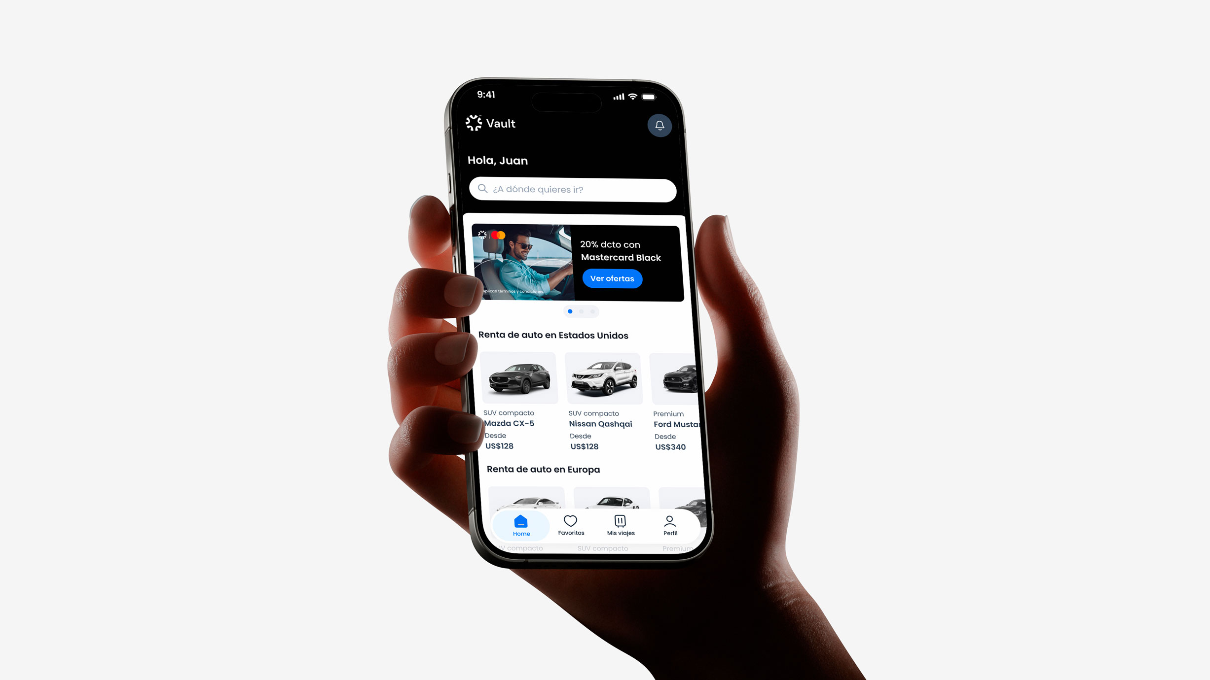
Vault is a mobile car rental platform designed to simplify and streamline the booking process. The project aims for an intuitive, fluid experience from search to confirmation, with clearer pricing, options, and conditions.
Challenge
The booking flow had friction points that could create uncertainty, increase support inquiries, and lead to drop-offs. The challenge was to simplify the journey, improve information clarity, and make it easier for users to complete their reservations.
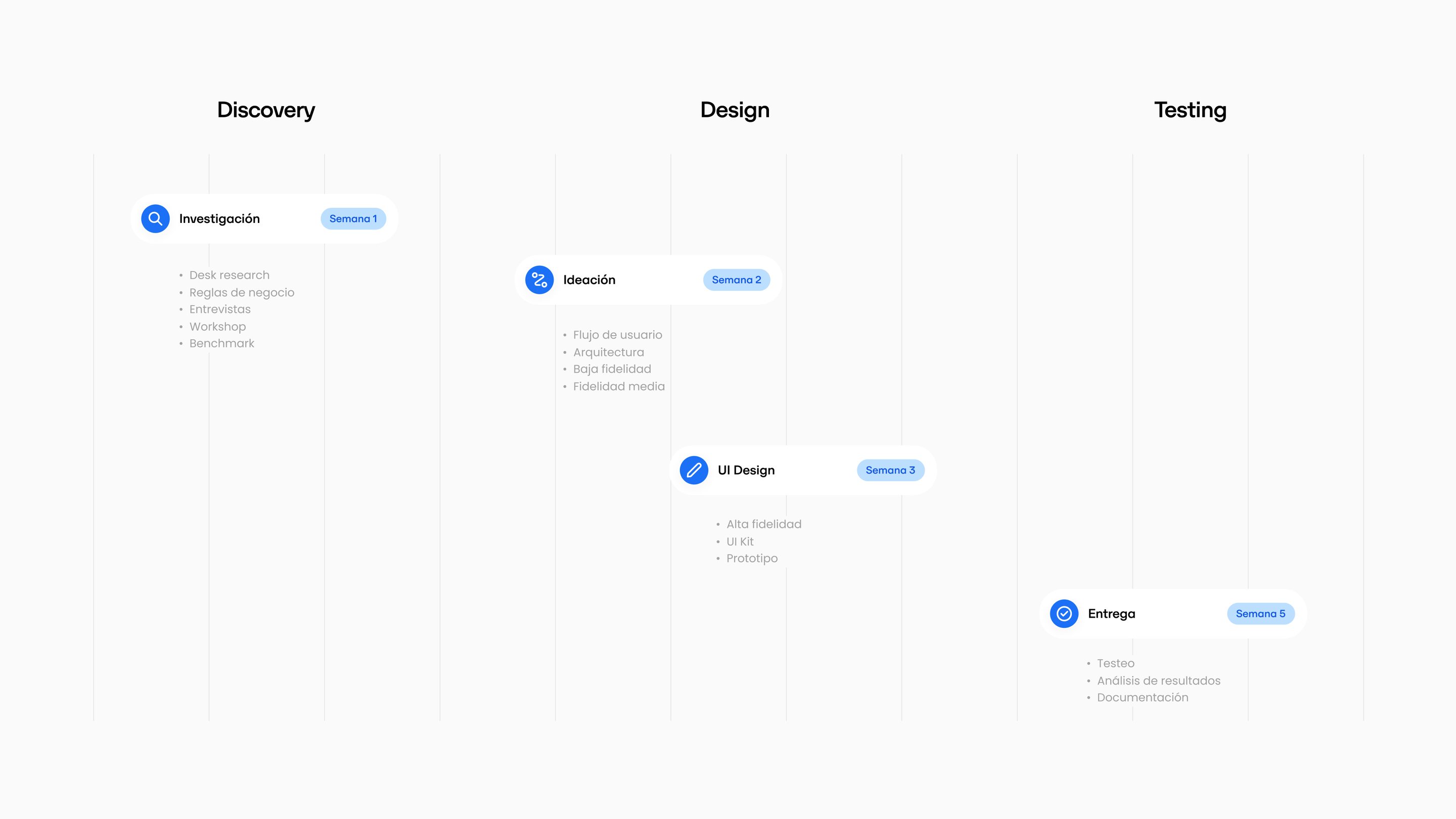
Research
Data
72%
Drop-off Rate

2%
Conversion Rate

58 min
Booking Time

56%
Support Inquiries
Decisions
 Before
 After
 Before
 After
Solution
We designed a clearer, more flexible, and more reliable car rental experience, allowing users to compare options, understand the total price, choose the terms that best suit their trip, and manage their reservation from start to finish.


We reorganized the information to highlight what users need to decide first, reducing visual clutter and making each stage easier to navigate.
We structured coverage options more clearly so users could understand the differences, evaluate alternatives, and make decisions with greater confidence.
We reorganized the process into progressive steps, presenting information at the right moment and avoiding decisions before they were necessary.


Validation
Usability testing showed positive results in the booking flow’s usability and navigation, with an 85% average task success rate and a SUS score of 78/100. However, the drop-off rate and misclicks revealed opportunities to further improve the experience.
Results

85%
Average Task Success Rate
15%
Drop-off Rate

17.3%
Misclicks

78/100
System Usability Scale (SUS)
Learnings
This project is built around a fundamental idea: a good transactional experience isn't measured by the number of elements it includes, but by how easily it helps users achieve their goals.
Redesigning the booking flow was an opportunity to connect user needs with business objectives by examining how each step, decision, and interaction contributes to completing a reservation.