
Residential
The communication should show how solar energy can reduce household expenses and generate long-term savings, explaining its benefits and installation process in a clear and approachable way.
Sunwise is a solar energy brand designed to make the transition to renewables clearer, closer, and easier to understand. The project connects brand identity and digital experience to communicate the value of solar energy and help homes and businesses explore solutions tailored to their needs.
Challenge
Sunwise necesitaba una marca capaz de acercar esta solución a las personas, sin perder la claridad y la credibilidad que exige un servicio relacionado con la energía. El desafío consistía en construir una identidad diferenciada y una experiencia digital que transformara la información técnica en una comunicación más accesible y relevante.
Strategy
Before defining the visual identity and digital experience, it was important to understand each audience’s motivations and tailor the communication to their priorities. While both seek to benefit from solar energy, each needs different reasons to make an informed decision.
Two Audiences
The communication should show how solar energy can reduce household expenses and generate long-term savings, explaining its benefits and installation process in a clear and approachable way.
The communication should focus on reducing operating costs, improving energy efficiency, and delivering a return on investment, helping businesses evaluate the financial benefits of adopting solar energy.
Concept
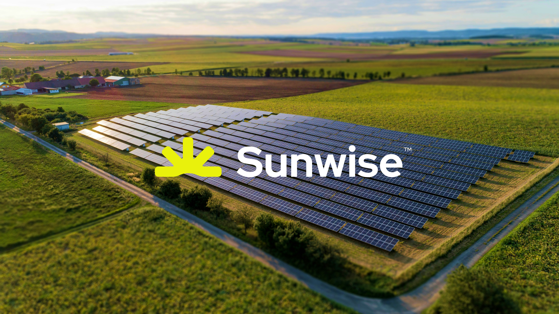
Sunwise is built around one idea: making solar energy a forward-thinking decision. It connects the potential of the sun with a more conscious approach to energy consumption, considering both present needs and the opportunities it creates for the future.


Visual identity
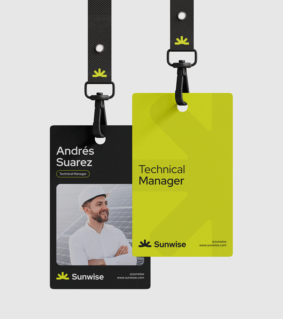
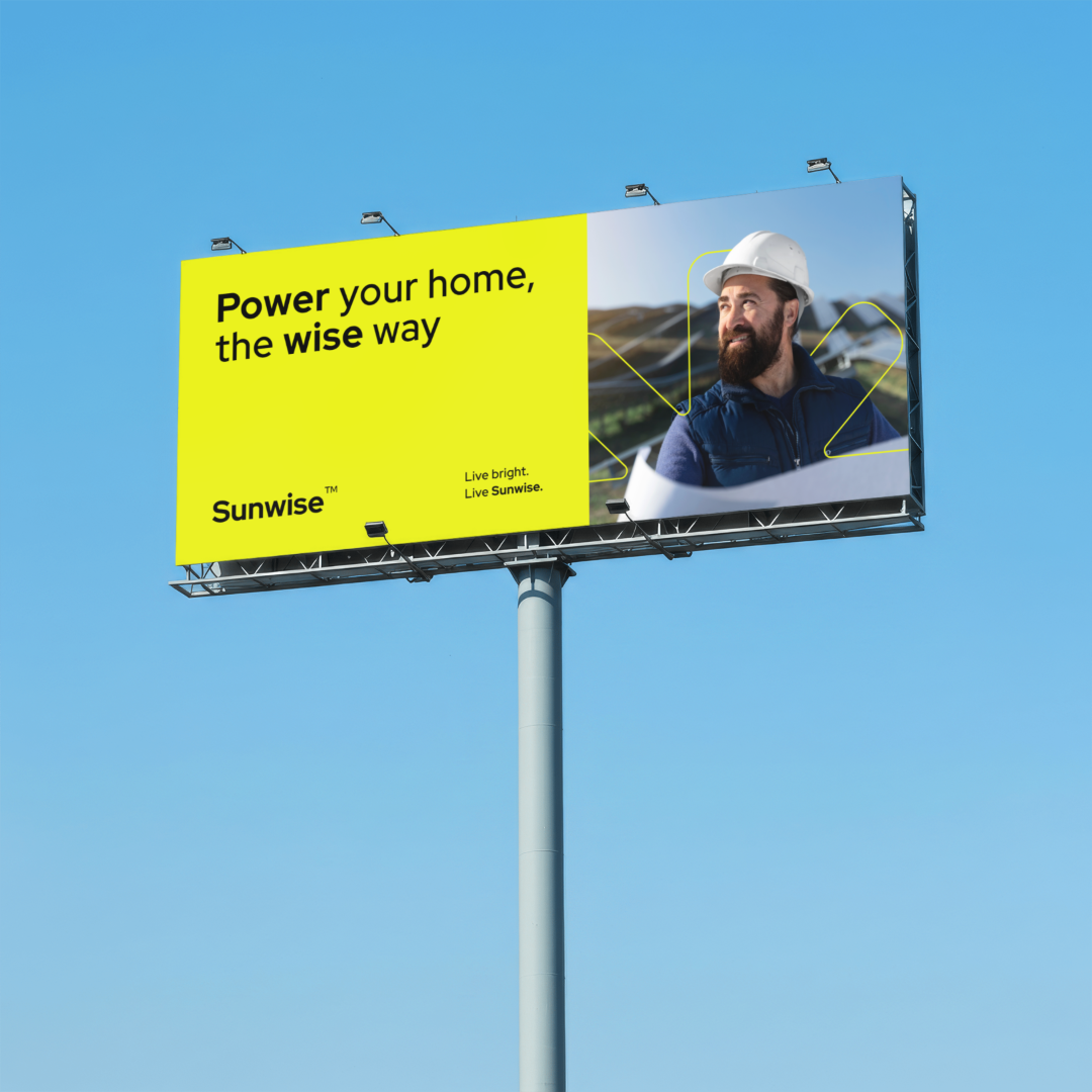
The visual identity was built around a bold graphic language designed to make Sunwise recognizable across different formats and touchpoints.
Vibrant green serves as the brand’s primary identifier, conveying energy and optimism. Black and white provide contrast, balance, and a clean visual foundation that enhances readability.
Experience
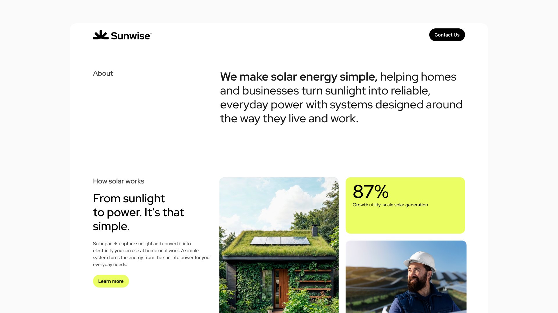
As Sunwise’s first digital presence, the landing page needed to serve a primarily informational purpose: introducing the company, explaining its solar energy services, and helping visitors understand its value proposition.
The goal was not to build a complex platform, but to organize essential information into a clear, cohesive, and easy-to-navigate experience.

Learnings
Sunwise was an opportunity to explore how visual identity and digital product design can work together to make a technical service feel more approachable and easier to understand.
The project reinforces the importance of connecting visual decisions with how people interpret information, evaluate options, and decide how to move forward.
